Casino lobby UX: the filter bar does more work than the hero
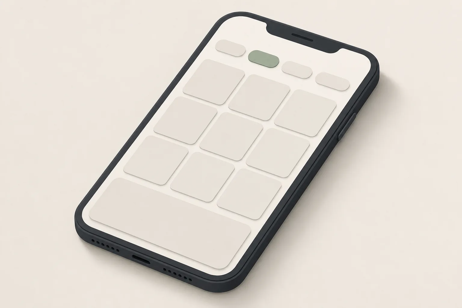
A casino lobby is not a shop window; it is a launcher. Most people who open it already know which game they want, or at least which kind. The lobby's job is to get them there in one or two taps — and the thing that does that job is the filter bar, not the hero.
Last reviewed: 21 September 2026 · Author: Rory Finch
Who actually arrives at a lobby
Session recordings from lobby projects I have worked on tend to sort visitors into three groups, in roughly this order of size (proportions vary by brand; treat the shape, not the numbers, as the point):
- Returners with a game in mind. They want the game they played yesterday. Their ideal lobby is a "recently played" row at the top and nothing in the way.
- Browsers with a category in mind. "A Megaways game", "something with a bonus buy", "live blackjack". Their ideal lobby is a filter bar that maps to how they think — mechanic, feature, studio, stake range — not to how the catalogue is stored.
- Genuine explorers. They will scroll, and they will use the hero. They are the smallest group, and the hero is designed for them at everyone else's expense.
The hero banner is also where the promotion lives, which is why it survives every redesign. But a promotion that pushes "recently played" below the fold is charging the largest group of players a scroll on every visit to reach the smallest.
What a good filter bar does
- Speaks the player's language. "Bonus buy", "high volatility", "jackpots", "new", "live" — not "Category 4". Mechanic filters (Megaways, cluster pays, hold-and-win) belong here on any catalogue over a few hundred games.
- Shows counts. "High volatility (212)" tells the player the filter is worth tapping. An empty result set is a broken promise, so filters that would return zero should be hidden or disabled, not shown.
- Stacks. Studio + feature + volatility is a common real query. Single-select filters force the player back to search.
- Stays put. A sticky bar on scroll costs 48 pixels and saves a scroll-to-top on every change of mind.
- Remembers. The last filter set is a better default for the next visit than "All games".
Search is a filter with a keyboard
On catalogues of a thousand games, search is the primary navigation for returners who have not played recently enough to be in the top row. Three things make or break it:
- Prefix and typo tolerance. "gates" must find Gates of Olympus; "big bas" must find every Big Bass game.
- Results as you type, with the tile and the studio name — a text list is a step backwards.
- Studio search. Many players remember the studio and not the title.
Tiles: the unit of the lobby
The tile is where art and information collide. What belongs on it: the game's art, its name on hover or focus, and — for the browsers — one or two badges (new, jackpot, live). What does not belong on it: RTP, volatility, and paylines. That information is mandatory in the game's info screen, and putting it on every tile turns the lobby into a spreadsheet. A single "info" affordance per tile is the compromise that works.
Tile size is a mobile decision. Two columns fit a name and a badge; three columns are a wall of art where nothing can be read. Most lobbies choose three for density; the ones that test it usually go back to two, with a denser "compact" toggle for the players who want it.
Where the promotion should go
Between the "recently played" row and the first category row. It is still above the fold on most phones, it is seen by all three groups, and it no longer taxes the returners. Brands that insist on the hero at the very top should at least make "recently played" the first thing beneath it and cap the hero at one screen-third.
A one-screen checklist
- Recently played is visible without scrolling.
- The filter bar uses player vocabulary and shows counts.
- Search finds games by prefix, typo and studio.
- Tiles show art and a name; details are one tap away, not on the tile.
- The promotion is present and does not push the first two points down.
If a lobby passes those five, the hero can be as beautiful as the marketing team likes.
The proportions and pixel figures above are illustrative, drawn from project experience rather than a published study.